I have a relative who owns a graphics shop. He can cut anything out of high-performance vinyl and so makes a lot of boat names for customers.
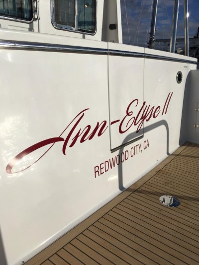
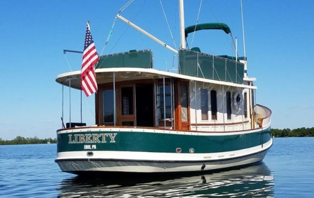
A good rule-of-thumb dimension for boat letter size on a typical transom is that the height of the name letters should be 1/3rd of the dimension from the waterline to the top of the transom. If you have a swim platform, it would take the place of the waterline from a visual perspective. The hailing port letters would be a simpler block font and approx 1/3rd of the name letters.
So let’s say your transom is 30” from the top of the swim platform to the top of the transom: The letters would be (approx) 10” tall. A block letter style (not script) is considered traditional, with or without “serifs” or shadowing. He doesn’t do gold leaf but it’s not uncommon to use for the shadow effect.
Your first reaction might be “That seems too tall”. But when you look at a boat with this letter style and height ratio it looks pretty good.