You are using an out of date browser. It may not display this or other websites correctly.
You should upgrade or use an alternative browser.
You should upgrade or use an alternative browser.
Post a Photo of Your Boat
- Thread starter Codger2
- Start date
The friendliest place on the web for anyone who enjoys boating.
If you have answers, please help by responding to the unanswered posts.
If you have answers, please help by responding to the unanswered posts.
Nomad Willy
Guru
Codger2
Guru
- Joined
- Oct 11, 2007
- Messages
- 6,691
- Location
- US
- Vessel Name
- Circuit Breaker
- Vessel Make
- 2021..22' Duffy Cuddy cabin
Eric:*nomadwilly wrote:" I'm not sure about the halo."
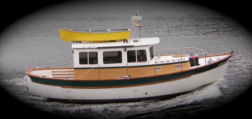
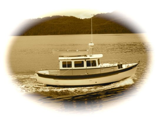
The halo is called a "vignette" and is used in photography to enhance & give a classic look to the picture. As far as I'm concerned your boat is a classic.
Here's a treatment that adds an antique look that I am partial to.
*
-- Edited by SeaHorse II on Sunday 18th of October 2009 09:42:56 AM
Attachments
Nomad Willy
Guru
Hi Walt,
I see you've taken the vignette off your avitar and I like it much better. To me .. part of what makes your excellent avitar is your Halvorsen's wake. I love the way is flows around the boat. The antique look of Willy is definitely enhanced by the vignette. I like your cropping the subject up close too. Thank you Walt.
Eric Henning
-- Edited by nomadwilly on Saturday 24th of October 2009 10:44:42 PM
Codger2
Guru
- Joined
- Oct 11, 2007
- Messages
- 6,691
- Location
- US
- Vessel Name
- Circuit Breaker
- Vessel Make
- 2021..22' Duffy Cuddy cabin
You're more than welcome Eric!
As you know, I've had my share of boats since 1995 but I've grown to love the smaller trawlers. They have most everything the big guys have but not the room. Sometimes I tell myself that I am on an Apollo mission and must tolerate the cramped quarters until my return.
As you know, I've had my share of boats since 1995 but I've grown to love the smaller trawlers. They have most everything the big guys have but not the room. Sometimes I tell myself that I am on an Apollo mission and must tolerate the cramped quarters until my return.
Attachments
Capt Dan
Senior Member
Nomad Willy
Guru
Keep the pics coming Dan. I like the stowing of the dinghy. I'm going out to Edna Bay and Marble Island (outer coast) tomorrow on the skiff. Took all day prepping and loading the skiff. See ya.
Nomad Willy
Guru
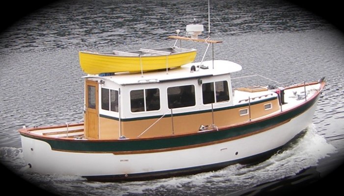
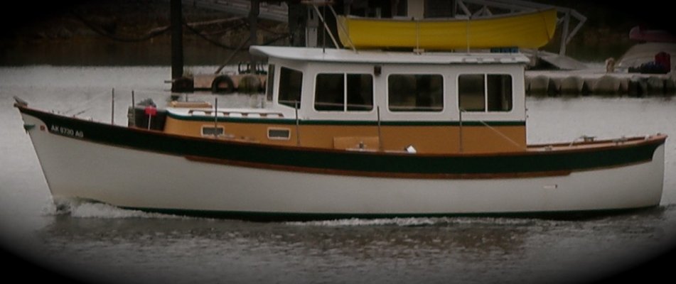
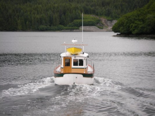
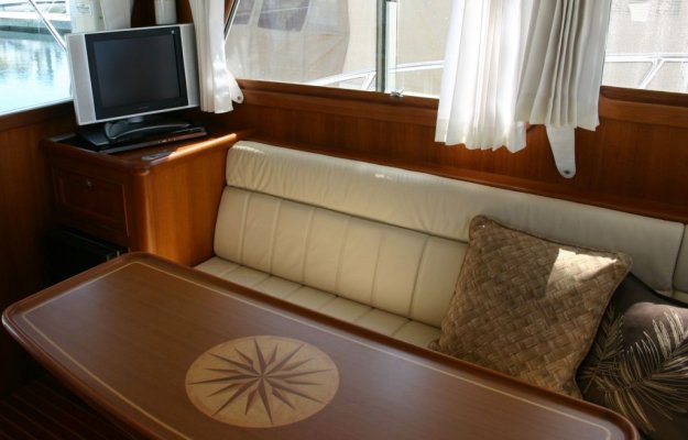
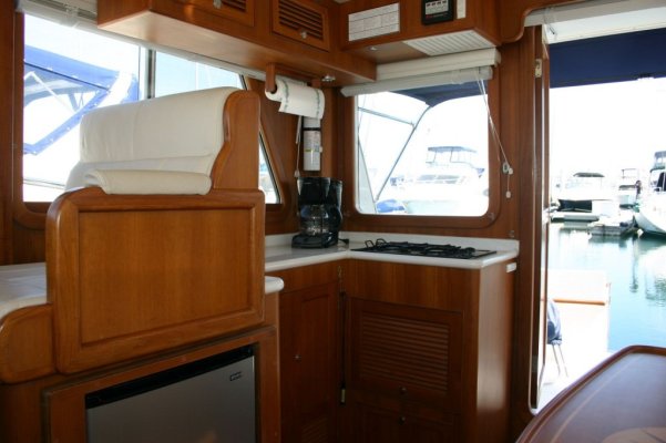
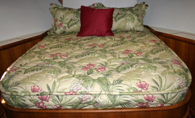
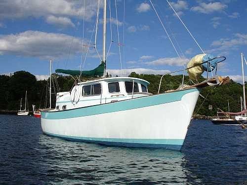
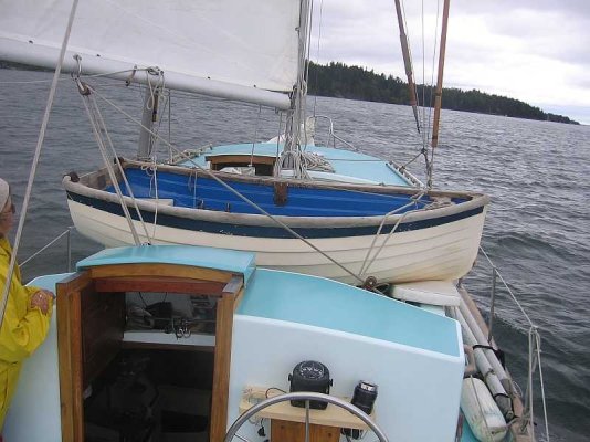
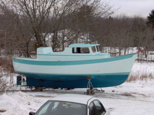
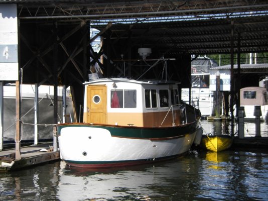
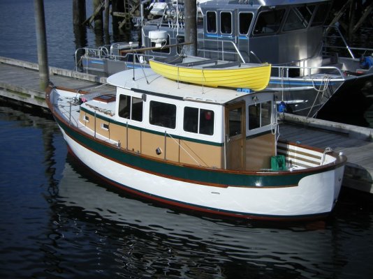
Here's some of Willy.
Attachments
-
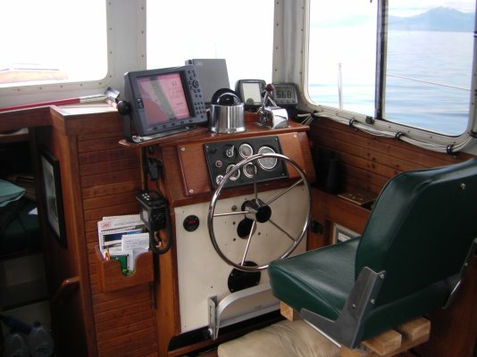 sth71154.jpg144.3 KB · Views: 161
 -
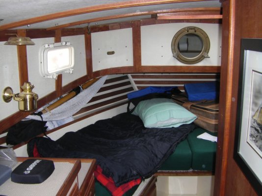 sth71156.jpg171.9 KB · Views: 168
 -
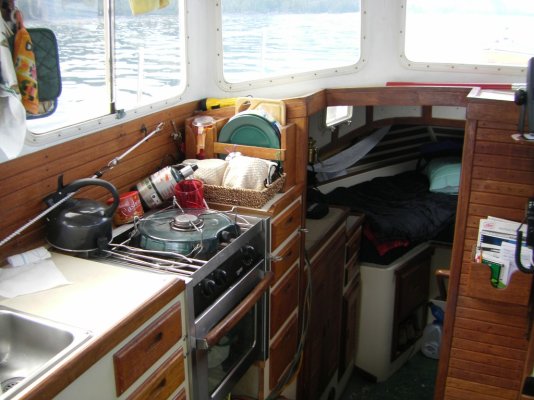 sth71157.jpg177.4 KB · Views: 163
 -
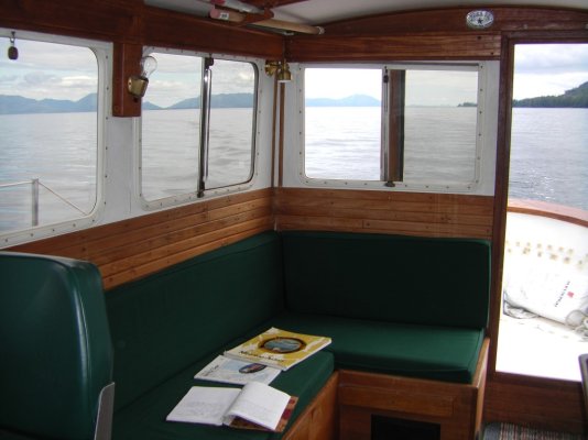 sth71158.jpg133.2 KB · Views: 166
 -
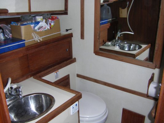 sth71159.jpg156 KB · Views: 163
 -
 sth71159.jpg156 KB · Views: 169
 -
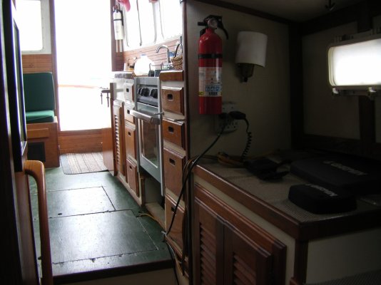 sth71160.jpg141.5 KB · Views: 172
 -
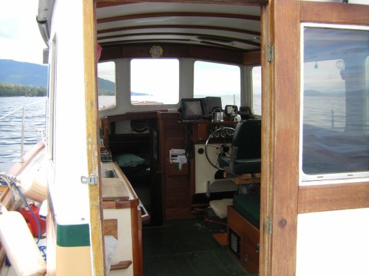 sth71164.jpg148.2 KB · Views: 165
 -
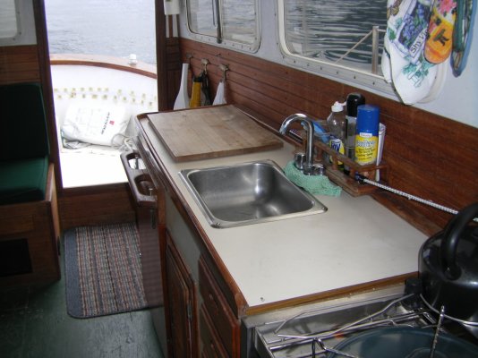 sth71165.jpg177.2 KB · Views: 162
markpierce
Master and Commander
- Joined
- Sep 25, 2010
- Messages
- 12,557
- Location
- USA
- Vessel Name
- Carquinez Coot
- Vessel Make
- penultimate Seahorse Marine Coot hull #6
Looks homey.
Nomad Willy
Guru
Thanks dad,That's what Willy's going to be when she grows up. See that round port? Looks awful. If it were mine I'd at least paint a black square around it.
- Joined
- Jun 25, 2008
- Messages
- 10,124
- Location
- Australia
- Vessel Name
- Now boatless - sold 6/2018
- Vessel Make
- Had a Clipper (CHB) 34
Nah....I'm cool with the round port Eric.....nomadwilly wrote:
Thanks dad,
That's what Willy's going to be when she grows up. See that round port? Looks awful. If it were mine I'd at least paint a black square around it.
*
*
Nomad Willy
Guru
Peter, Walt,Look at these pics of Willy w her original round port in the door and the full window I replaced it with. I really like my rectangular window.
-- Edited by nomadwilly on Friday 22nd of October 2010 10:32:03 AM
-- Edited by nomadwilly on Friday 22nd of October 2010 10:32:03 AM
Attachments
Codger2
Guru
- Joined
- Oct 11, 2007
- Messages
- 6,691
- Location
- US
- Vessel Name
- Circuit Breaker
- Vessel Make
- 2021..22' Duffy Cuddy cabin
Eric:
I'd like to retract my last statement. I don't know why, but I thought you had a round port light on the side of Willy. It's obvious, by looking at your avatar, that you don't! Sorry about that. I agree, the round port light in the salon door is horrible! Your rectangular window is more in keeping with good design.
-- Edited by SeaHorse II on Friday 22nd of October 2010 03:09:14 PM
Eric---nomadwilly wrote:
Look at these pics of Willy w her original round port in the door and the full window I replaced it with. I really like my rectangular window.
I agree that the original port in your cabin door looks quite wussy and your rectangular window looks 100% better.* So good job with that one.
However I have to say that I do like the round port in the side of the larger Willard in the photos that Daddyo posted.* I think a rectangular window there would make the boat look too "busy."* It appears the round port is in the top half of a Dutch door or an opening panel of some sort.* But I quite like it.* It visually lengthens the boat and separates the "pilothouse" from the main part of the cabin,*where another square shape in that same place would, I think, start making the boat look a little clunky.
But then I've never had a problem mixing round windows with rectangular (or trapazoidal) ones
*
Attachments
Nomad Willy
Guru
Don't like it on the Beaver either. It's like designing a car w the front having nice soft rounded and curved shapes and lines while producing the car w an after end designed and shaped with very angular, hard and more or less straight lines and sharp angles. It would look awful. I think Kenmore Air did it for structural reasons (or similar) and just didn't have any sense of what shape looked good or worked well w the other shapes on the plane. But I'm glad you agree I did improve the appearance of Willy.
Tidahapah
Guru
- Joined
- Oct 7, 2007
- Messages
- 1,859
- Location
- Australia
- Vessel Name
- Flora
- Vessel Make
- Timber southern cray boat
Eric,
I agree the round port looks out of place.
The mod you have done looks good.
I have also noticed that the Selene Trawlers have a round port that I have allways thought looked out of place.
like your style.
Benn
I agree the round port looks out of place.
The mod you have done looks good.
I have also noticed that the Selene Trawlers have a round port that I have allways thought looked out of place.
like your style.
Benn
- Joined
- Jun 25, 2008
- Messages
- 10,124
- Location
- Australia
- Vessel Name
- Now boatless - sold 6/2018
- Vessel Make
- Had a Clipper (CHB) 34
I think it all a question of symmetry. I agree with Eric's Willy, (no s******s now), the round window in the rear door looks odd, because it was to the left of two square ones and in a row, so logically all being square looks better balanced. Not to mention giving a better view. However, the one round port on each side but in the same place, looks ok, because it's symmetrical. Might not be everyone's cuppatea, but ok all the same. So Marin and I agree on that one, I think.
PS - I was trying to write the word s - n - i - g - g - e - r - s, not use a racially offensive term....that language police thing is really sensitive, eh?
-- Edited by Peter B on Saturday 23rd of October 2010 05:20:52 AM
PS - I was trying to write the word s - n - i - g - g - e - r - s, not use a racially offensive term....that language police thing is really sensitive, eh?
-- Edited by Peter B on Saturday 23rd of October 2010 05:20:52 AM
RT Firefly
Enigma
Hiya,
** Snicker, snicker...Saltwoter.* I suppose the language police have no concept of the Queen's english
-- Edited by RT Firefly on Saturday 23rd of October 2010 06:47:04 PM
** Snicker, snicker...Saltwoter.* I suppose the language police have no concept of the Queen's english
-- Edited by RT Firefly on Saturday 23rd of October 2010 06:47:04 PM
No, Kenmore's rectangular window that replaces the original porthole was not done for structural reasons.* In fact it introduced a huge structural problem because the Beaver has a monocoque fuselage.* They designed and developed the rectangular rear window to give passengers in the rear seat a better view.*nomadwilly wrote:
I think Kenmore Air did it for structural reasons (or similar) and just didn't have any sense of what shape looked good or worked well w the other shapes on the plane.
The original Beaver used the porthole because it's the only size of window that would fit within the fuselage's structure in that part of the plane.* Kenmore had to do some pretty fancy design work around their window to retain the fuselage strength.* There has since been an additional rectangular window added to many Beavers to put more light in the baggage compartment and rear of the cabin but I don't care for this multi-window look at all.* I do like Kenmore's original modification, and I like the porthole too in terms of aesthetics.
These are two of Kenmore's planes I've got a fair amount of time in.* 355 has the original Kenmore window replacement for de Havilland's porthole.* 81L has the added aft window behind Kenmore's original one.* I don't care for this look.
*
Attachments
Craig Tomash
Member
- Joined
- Oct 19, 2007
- Messages
- 12
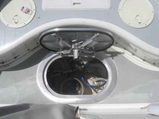
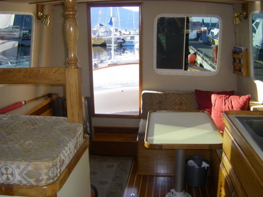
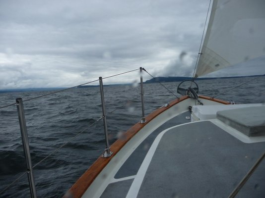
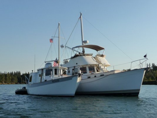
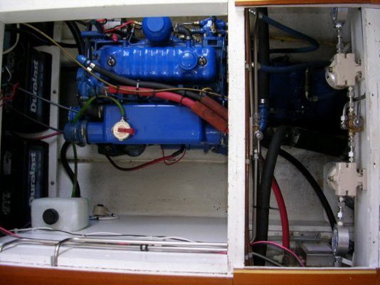
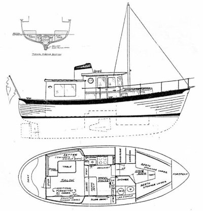
Well as the post asked to post photos here is a few from MV Kozad:* 1974 Willard 40 Voyager:
Attachments
-
 resized to 1mb.jpg256.4 KB · Views: 134
 -
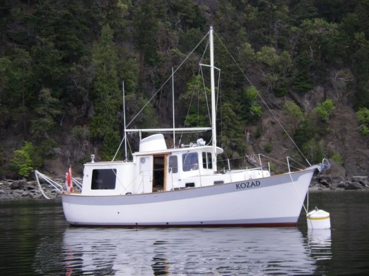 imgp0809.jpg199.5 KB · Views: 151
 -
 kozad at chatterbox falls princess louisa inlet.jpg128.7 KB · Views: 130
 -
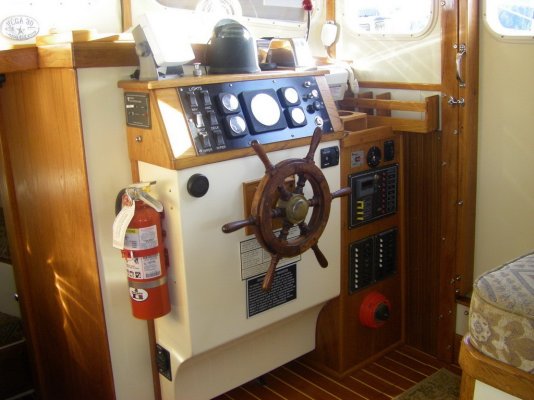 copy of imgp0142.jpg174.2 KB · Views: 122
 -
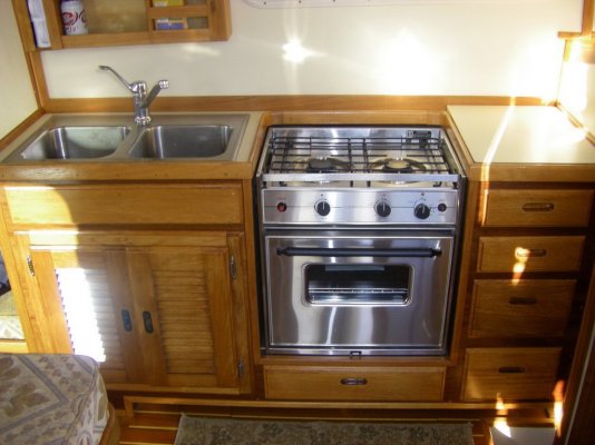 imgp0144.jpg159.7 KB · Views: 131
 -
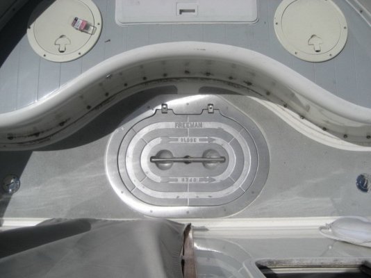 img_0696.jpg122 KB · Views: 132
 -
 img_0699.jpg121.8 KB · Views: 131
 -
 imgp0149.jpg171.2 KB · Views: 129
 -
 p1080946.jpg139.6 KB · Views: 139
 -
 p1090118.jpg139.9 KB · Views: 124
 -
 kozad rafted to northstar - quite the size difference between a w30 and w40.jpg115.3 KB · Views: 132
 -
 engine room.jpg149.2 KB · Views: 142
 -
 willard drawing.jpg83.6 KB · Views: 153
Nomad Willy
Guru
Craig,
Glad your'e here. It's about time these guys saw what a Willard should look like. Your boat is gorgeous and I love seeing pictures of her. Hope you got in some good cruising this summer*** ....we did NOT. Plan to make up for lost cruising next summer spending more time in north SE. So far this winter has been mild. Was almost 50 today ans I worked on the garage. Hope you get up here some day Craig.
Eric Henning
markpierce
Master and Commander
- Joined
- Sep 25, 2010
- Messages
- 12,557
- Location
- USA
- Vessel Name
- Carquinez Coot
- Vessel Make
- penultimate Seahorse Marine Coot hull #6
<a>
 </a>
</a>
Craig, under what circumstances do you typically*use the staysails?* "Jib" when wind off stern?* "Main" with wind off bow?* "Jib" and "main" when wind off beam?
Craig, under what circumstances do you typically*use the staysails?* "Jib" when wind off stern?* "Main" with wind off bow?* "Jib" and "main" when wind off beam?
alohaboat
Member
- Joined
- Oct 14, 2007
- Messages
- 8
ALOHA is a 2002 Willard 40 Pilothouse trawler, powered by a John Deere 4045TD.* She is the last Willard trawler built.* I am the original owner.* ALOHA has been berthed in La Paz, Baja California for the last 4 years.* Future plans include a transPacific passage.
Pictures were taken "in da islands" in the Sea of Cortez.
 *
*
 *
*
 *
*

 ** *
** *

-- Edited by alohaboat on Saturday 27th of November 2010 07:08:51 AM
Pictures were taken "in da islands" in the Sea of Cortez.


-- Edited by alohaboat on Saturday 27th of November 2010 07:08:51 AM
Nomad Willy
Guru
Patrick,
It's great that your'e here too. We now have a significant force here on TF. I've been hang'in out w these guys for several years. Started when all I did on the computer was WBO. To keep from getting too bored during the weeks long dead periods on WBO I came over here. There's much to learn here from current activity as well as the archives like WBO but there's much more here and a different perspective as well.
Some day I'd like to get down in Baja right about where you are. I have "The Baja Adventure Book" and some day I'm going to stop hibernating in winters and get on down there. We do know people that winter there*** ...Arrowsmith.
Similar threads
- Replies
- 2
- Views
- 1K
- Replies
- 3
- Views
- 2K
- Replies
- 13
- Views
- 841
Latest posts
-
-
-
-
-
-
-
-
-
-
Spectra water maker fresh water flush module valve position
- Latest: Portage_Bay

